Flexbox: I think I get it now
November 29, 2016 By Hiep Dinh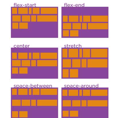
I’ve been aware of Flexbox since at least 2014, but avoided using it until now. So many new things to learn, so little time! Until recently the display “block” and “inline block” properties were fine for my layout needs. Now that browser support for Flexbox is widespread, and many of the bugs are well understood, I thought I’d revisit how to use Flexbox to see if it’s a worthy addition to my dev toolbox.
After following along with Wes Bos’ excellent video tutorial, and then reading the spec, I think I’m finally starting to understand Flexbox.
For this post I’ll focus on a few basic concepts that are necessary to understand first. I’ll provide some tips and techniques if you’re new to Flexbox and running into issues – and you probably will run into issues – particularly with alignment. This post assumes minimal (but not zero) exposure to Flexbox previously.
Flexbox Beginner’s Mind
First of all, I had to force myself put aside everything I knew about “block”, “inline-block”, and “table-cell” based layouts and hacks, making a new home in my brain for Flexbox’s unique way of doing things. Easier said than done, because Flexbox offers several new properties for aligning your content horizontally and vertically, and/or changing the order of that content, and/or automatically sizing that content to best fit its container. WHEW!
Axes hurt my brain
Once you “display: flex” an element it becomes the “flex container”. Its children elements, the “flex items”, are laid on a “main axis” which flows in one particular direction. Perpendicular to that main axis is the “cross axis”.

By default the “flex-direction” of a flex container is “row”, which means (for us developers here in the Western world) the main axis runs horizontally, with its flex items running left to right (“row-reverse” will change the direction from right to left), and the cross axis runs vertically.
But if you change your “flex-direction” to “column”, the axes get flipped around: the main axis will now run vertically, with the flex items running from top to bottom (“row-reverse” will change the direction from bottom to top), and the cross axis will run horizontally.
After developing sites without Flexbox for several years I wasn’t used to having much control over alignment in the vertical dimension when working on layout-related CSS, so having to keep track of 2 axes in Flexbox was a challenge at first.
Take a look at the Pen and notice how the main axis and cross axis will change depending on the “flex-direction”.
See the Pen ALYExA by Carl Dinhski (@carl_dinh) on CodePen.
Questions and Examples
When attempting to use Flexbox, first ask yourself: where do I want to establish my main axis and cross axis? It’s important to stay aware of where your main and cross axes are, because each axis has its own set of alignment properties (shown further below), and of course you’ll want to use the most appropriate Flexbox layout – “column”, “row”, or a combination of both – to best serve your content.
A good example of how Flexbox columns and rows could work together is for a group of product excerpts.
For example, using Flexbox we can lay the product excerpts inside a row, which will give us equal height excerpts right away. Then inside each individual excerpt we can use a column layout so the content within (title, image, description, “Add to Cart” button) will stack on top of each other and we’ll also have the ability to use Flexbox auto margins (covered in more detail later) to easily pin the “Add to Cart” button to the bottom of the excerpt:
See the Pen xENqPa by Carl Dinhski (@carl_dinh) on CodePen.
New ways to align things, and some problems you might encounter
As I mentioned earlier, the main axis and the cross axis have unique alignment properties.
Alignment properties for the main axis:
Alignment properties for the cross axis:
The above properties apply to the flex container only, but you can override an individual item using the “align-self” property:
See the Pen KgOzLR by Carl Dinhski (@carl_dinh) on CodePen.
When you’re starting to play around with Flexbox you might notice that some of the alignment properties aren’t working. A useful debugging tip that I learned from “What the Flexbox?!” is that, depending on which alignment property you’re trying to use, you might have to create extra space on the main or cross axes to give your Flex Items the space they need to move.
For example, by default a Flex Container’s height is the combined height of all its Flex Items, so if you’re working on a “column” layout and attempting to use “justify-content”, check if your Flex Container has enough space for “justify-content” to work – it’s easy to forget about this in the beginning. In order to see how much space you have in your Flex Container, Wes suggests adding a brightly colored border to the container, as shown in the example below:
See the Pen ORKyNO by Carl Dinhski (@carl_dinh) on CodePen.
Auto Margins
Another neat alignment option in Flexbox is auto margins. In the product excerpt pen I demonstrated how we can use a top auto margin on the button to pin it to the bottom of the excerpt. This behavior is possible in Flexbox because according to the spec:
Prior to alignment via justify-content and align-self, any positive free space is distributed to auto margins in that dimension.
In the following pen, I’ve combined “justify-content” and auto margins to address a common pattern: a large banner image with a logo and nav superimposed on top (logo on the left, nav on the right), and centered text using auto margins for the banner title, which will center the text horizontally and vertically:
See the Pen xEBoaW by Carl Dinhski (@carl_dinh) on CodePen.
I found the “centering text” technique in Lea Verou’s recent book on CSS, “CSS Secrets“. Because the “banner-title” has “margin: auto;” applied to it, Flexbox will distribute the positive free space on the top, right, bottom, and left of the text, resulting in easy horizontal and vertical centering.
We’ve covered only a small portion of what’s possible in Flexbox. For more information I highly recommend Wes Bos’ video tutorial on flexible boxes. Be sure to code along with the later videos. After that, take a look at the W3C Documentation on Flexbox and continue to experiment! Flexbox can be confusing at first, but stick with it! The benefits are worth the effort.

View Comments