How to Create Cool Animated Form Labels Using the Float Label Pattern
January 2, 2020 By Andrew Gehman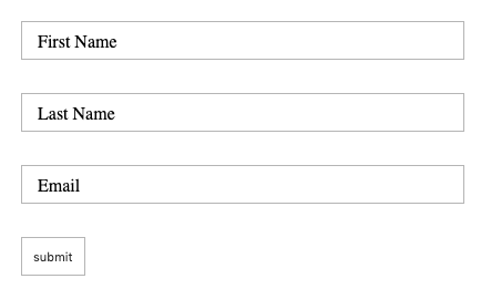
While browsing the Internet, you may have seen forms where the form field placeholder text moves from within the form field just above the field like a label. This is often referred to as the “Float Label Pattern.” Here’s a closer look at how to create cool animated form labels using the Float Label Pattern:
1. Create a Simple Form
Let’s start with a simple form with first name, last name, and email fields. Each set of labels and input fields is wrapped in a containing div. It should look something like this:
<form id="shipping-address-form">
  <div class="field-wrapper">
     <label for="firstName">First Name</label>
     <input type="text" name="firstName" value="" id="firstName" class="text-field-input">
  </div>

  <div class="field-wrapper">
      <label for="lastName">Last Name</label>
        <input type="text" name="lastName" value="" id="lastName" class="text-field-input">
  </div>

  <div class="field-wrapper">
      <label for="email">Email</label>
        <input type="email" name="email" value="" id="email" class="text-field-input">
  </div>
  <div class="field-wrapper">
    <input type="submit" value="submit">
  </div>
</form>
Without any CSS, this is a pretty bland looking form. You may notice we haven’t added placeholder text. That’s because, rather than using the placeholder attribute, we are going to position the form label over the input to give it the appearance of being placeholder text.
2. Style the Form
The “Float Label Pattern” typically transitions the label to a position above the form field when we’ve clicked on the input field or after we’ve entered text in the field. In this example, we’re going to give the form field a style similar to a fieldset element with a legend rather than placing the label above the input, so that it looks similar to this:
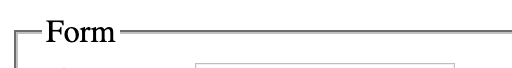
Add Padding and a Border
The input fields will remain pretty basic. We’ve added 10px of padding and a border for styling and a fixed-width simply to keep the fields consistent in this example.
input[type="text"],
input[type="email"] {
  padding: 10px;
  width: 400px;
  border: 1px solid #b5b5b5;
}
Position the Labels and Input Fields
The labels and input fields are wrapped in a containing div element with a class name of “field-wrapper.” The containing div elements have position: relative applied to them so that the label can be positioned relative to the containing div. Next, position absolute is used in combination with a bit of margin and padding to place the label in the middle of the form input field.
label {
    position: absolute;
    white-space: nowrap;
    overflow: hidden;
    top: 0;
    display: inline-block;
    background: #FFF;
    margin: 8px 5px;
    padding: 0 10px;
    transition: position .2s linear;
    background: #FFF;
}
Note: You could do this without the margin and padding and just use top, bottom, left, or right to position the label.
At this point the form should look something like this:
Use JavaScript and CSS Transitions to Move Labels Out of the Way
Our form input fields appear to have placeholder text, but it’s really a label element.
The form is looking better but users are unable to type anything into the input fields. This will be fixed by moving the label out of way by using some JavaScript and CSS Transitions.
The label needs to move anytime a user enters the input field to type, or anytime the field has been filled out. The first step in this process will be to determine where to place the label when it is moved. In this case, I’ve decided I want to place the label “on top” of the top border on the input field to give it the look of a fieldset with a legend.
Changing the top position to -20px will move the label where I want it to be. The CSS class “focused” will be given top: -20px and transition: all .2s linear values.
.field-wrapper.focused label {
  transition: all .2s linear;
  top: -20px;
}
3. Add Interactivity with JavaScript
By using some JavaScript (in the example below we’re using the jQuery library) to add a class to the containing div, the correct label can be targeted and the label can be moved out from the input field as needed.
<script>
$(document).ready(function(){

  $('.text-field-input').on('focus', function(){
    $(this).closest('.field-wrapper').addClass('focused');
  });

  $('.text-field-input').on('blur', function(){

    if  ( $(this).val() === '') {
       $(this).closest('.field-wrapper').removeClass('focused');
    }
  });

})
</script>
The code above adds a class of “focused” anytime a user clicks into the input field. It is removed anytime a user exits the input field without typing any text.
See the Pen Animated Form Labels by Andrew Gehman (@AndrewGehman) on CodePen.
With these steps, you can create cool animated form labels using the Float Label Pattern. Are floating labels good in every case? Probably not. This article on the Float Label Pattern gives a good overview of some of the pros and cons to help you determine if it’s right for your use case. For simple forms with short text labels, they may be a great way to bring a little fun to your forms.

View Comments