

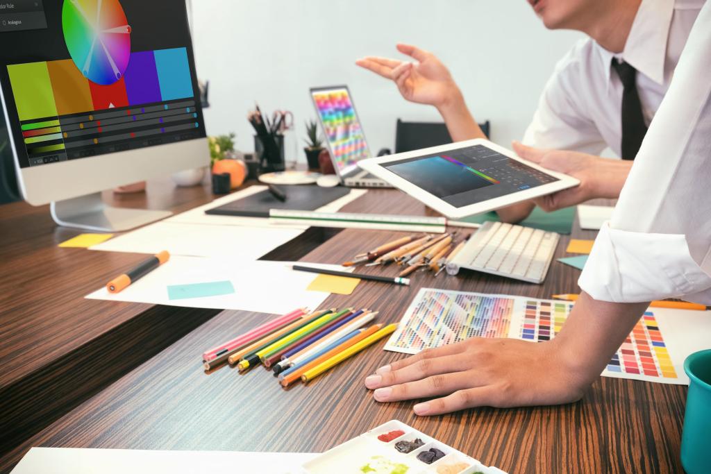
Not all graphic design is the same and a lot goes into making something “look good”. Even within the same mediums, there is a lot of variation. Design has to be customized based on a multitude of different factors. When it comes to web design vs print design, there are a lot of differences between them and each requires different approaches. Here are some of the biggest differences between web design and print design:
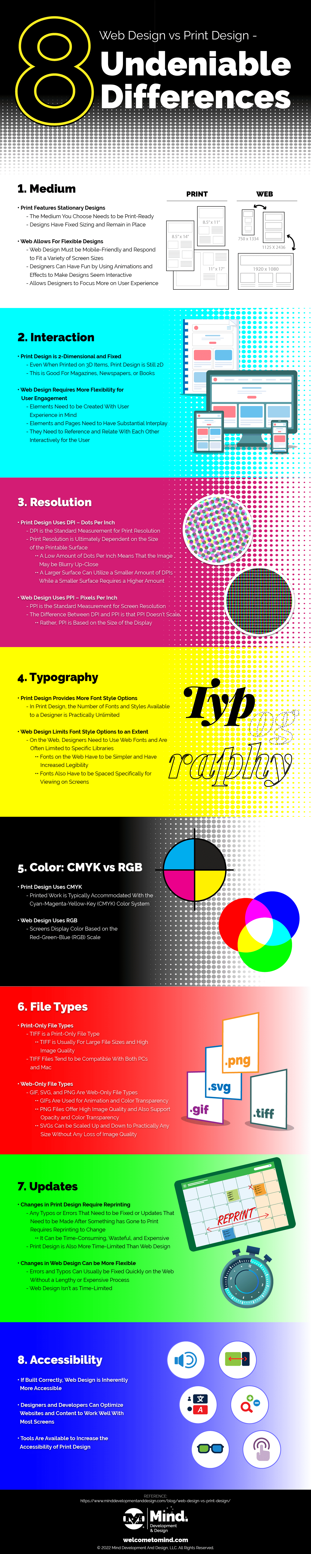
1. Medium
The biggest difference between website design and print design is how you view it.
Print Features Stationary Designs
Print design is pretty self-explanatory — the medium you choose needs to be print-ready. Day-to-day business items like business cards and stationery are printed on special cardstock and letter paper stock. Clothing and accessories are branded with logos and design elements using fabrics and specific inks.
Just about anything you look at has been printed in some respect. Despite the number of options you have in print design with what you can actually print on, one thing remains consistent and that’s the need for fixed sizing. Once a design is printed on something, it doesn’t move. The medium a design is printed on may move, but the design itself remains in place.
Web Allows For Flexible Designs
Web design, on the other hand, allows for significantly more flexibility with your layout and elements. Since modern websites need to be responsive and mobile-friendly, the designs too must be mobile-friendly and thought out in a way that accounts for the viewing of a website through different viewports or screen sizes.
While this may frustrate print designers at first when designing something for the web, it’s a small hurdle to overcome and, in many ways, helps to improve the overall design of the website itself. Additionally, since the elements are not in a fixed position on the screen, designers can have some fun with them and use things like animations to show movement and effects to make design elements seem interactive.
In some ways, web design is hindered by its flexible nature, but it makes up for that by allowing designers to place more emphasis on the user experience.
2. Interaction
In addition to how you view print design vs web design, there is a difference in how you interact with each medium as well.
Print Design is 2-Dimensional and Fixed
Print design is 2-dimensional even when it’s printed on a 3-dimensional object and assets are static and fixed on a page, shirt, bag, etc. Although users can turn a page and the content featured may relate to and reference each other, each view is a single design unit that is created for a fixed canvas size.
Designers do want to create a sense of consistency and cohesiveness for a newspaper, magazine, book, brochure, etc. with pages that can be turned, but those singular views do not tend to have substantial interplay between views or spreads.
Web Design Requires More Flexibility for User Engagement
Although there is space for some 2-dimensional relationships between page elements on the web, the web is fundamentally a scrolling experience. Elements and pages, or different views, need to have substantial interplay; they need to reference each other and relate to each other in a layout more interactively because a user can engage with them more interactively.
Users can scroll before elements are fully rendered, they can jump or scroll to different areas of a page or a website to view the content they care about, and more. A web designer has to be concerned with the look and feel of the web design and, in the case of a website or app, multiple user pathways as well – there are more elements of user experience to consider and that need to relate seamlessly to each other.
3. Resolution
Another well-established difference between web design and print design is resolution. For the most part, everyone understands that resolution affects the print size of a document. However, they may still get hung up on DPI and PPI as well as why the two are distinct from one another.
Print Design Uses DPI – Dots Per Inch
DPI stands for “Dots Per Inch” and is the standard measurement for print resolution. Traditional printing requires the separation of colors and the transfer of those colors to a printable surface. The clarity of detail is dependent on how much ink is used within 1 square inch — or how many ink “dots” per inch of printable surface are used.
Print resolution is ultimately dependent on the size of the printable surface. A low amount of dots per inch means that the image may be blurry or unrecognizable up close. Alternatively, a higher DPI means the image would be more clear with more distinct details up close.
For example, a full-color brochure would be printed at 300 DPI in order to make all of the content and images as clear as possible. But, a billboard you see while driving on the highway might only be printed at 10-15 DPI. While it looks crisp and clear as you drive by, due to scaling, if you were to get up close you would see the separation of color much clearer.
Web Design Uses PPI – Pixels Per Inch
PPI stands for “Pixels Per Inch” and is the standard measurement for screen resolution. The big difference between DPI and PPI is that PPI doesn’t scale. Rather, it’s based on the size of the display. On a screen, a 500px x 500px image at 72 PPI will look the same as a 500px x 500px 300 PPI image.
With respect to the display, they are equivalent. However, If you were to then print both of those images, you would see that the 300 PPI image appears clearer than the image at 72 PPI. Remember, resolution affects the print size, not the size of the screen.
So, while this is good information to have for either a print or web designer, it might not be as important for the website designer to fully acknowledge. What is important for the web designer to acknowledge is that the images are high enough quality to render well on the web; low-quality images are one of the common web design mistakes to avoid.
4. Color: CMYK vs RGB
As a follow-up to the differences in resolution, there are also differences in color systems. Screens display color based on the Red-Green-Blue (RGB) scale while printed work is typically accommodated with the CMYK color system; Cyan-Magenta-Yellow-Key (or Black). The major difference in these systems is how light is treated; is light emitted or is it absorbed?
Print Design Uses CMYK
CMYK is a “subtractive” color system. In order to see pigment, light must be absorbed and reflected. Pigment that is printed on a document absorbs all light except that which you see reflected back. When you mix pigments together, the effect is opposite that of using light — mixing pigments makes everything get darker because they absorb more light but don’t reflect it back.
Web Design Uses RGB
RGB is an “additive” color system. RGB treats color like light. Adding light together makes everything brighter. Adding all colors of light together makes white. Since screens emit light, it makes sense to use RGB color.
5. Typography
Although both web design and print design have to consider kerning, tracking, leading, and ascender and descender height, there is some variation when it comes to the typography – the font styles used.
Print Design Provides More Font Style Options
In print design, the number of fonts and styles available to a designer is practically unlimited. Although a designer still has to make sure any fonts in their print design are legible, they have a little more flexibility to get creative since their canvas is a fixed size. Generally, the fonts can be used as they are in print because the designer knows the final outcome of the design.
Web Design Limits Font Style Options to an Extent
To an extent, font options are more limited in web design. On the web, designers need to use web fonts and are often limited to specific libraries. Although there are still a lot of options available, many ways to use fonts effectively in website design, and plenty of room for creativity, fonts on the web have to be simpler and have increased legibility compared to print fonts because they are on a screen.
They also have to be spaced specifically for viewing on screens. There is space for creativity in design and fancy flair on fonts on the web, but in more limited situations than in print because of the need for simplicity and legibility even on smaller screens.
6. File Types
There are some file types that print and web design share, some that are software-specific, and some that are specific to print design and web design respectively. JPG or JPEG, PDFs, and EPS files are used in both print design and web design. PSD files are specific to Photoshop while AI files are specific to Adobe Illustrator. Here is where the file types differ:
Print-Only File Types
TIFF is a print-only file type. This file type is usually for large file sizes and high image quality. Compressing these files does not reduce their quality like what can happen when compressing JPG files.
TIFF files tend to be compatible with both PCs and Macs. Because of their high image quality, they are usually the file type used for the final handover of the design asset to a printer for the next steps.
Web-Only File Types
GIF, SVG, and PNG are web-only file types. GIFs are used for animation and color transparency. Their color capabilities are not quite as good as JPG files, but they have a smaller file size, which can help with keeping loading speeds fast. GIF files can be a good option for simple graphics on the web, especially those with animation, while keeping pagespeed and SEO in mind.
PNG files offer high image quality and also support opacity and color transparency. SVGs are a popular file type for web design because they can be scaled up and down to practically any size without any loss of image quality; with a responsive and mobile-friendly web design, this is a helpful feature.
7. Updates
The way updates are handled and the lifespan of designs are different for web design vs print design.
Changes in Print Design Require Reprinting
Any typos or errors that need to be fixed or updates that need to be made after something has gone to print requires reprinting to change. If these changes need to happen after the full first run has been printed, it can be time-consuming, wasteful, and expensive.
This is why it’s so important to have several quality checks in place and to verify the samples at each stage for accuracy and, frankly, perfection. Any changes you need after the initial print run will need to be big enough to justify a reprint.
Print design is also more time-limited than web design. For example, if you have business cards with a certain phone number or a brochure with certain hours and that information changes, the only way to update it is through a reprint.
Changes in Web Design Can be More Flexible
Although not all changes in web design are easy and straightforward, they do tend to be more flexible and easy to handle than print design. Errors and typos can usually be fixed quickly on the web without a lengthy or expensive process. When it comes to content maintenance, like changing a phone number or updating business hours, you can do that easily in web design without needing an entire overhaul.
In the case of a website, there is also flexibility in terms of adding new content or new pages. And, you can usually do this relatively easily if your website uses a CMS (content management system). This ease of use, especially when it comes to simple content updates, is one of the big benefits of using WordPress for your website.
There may be signs you need a new website or bigger changes you want like overhauling the look and feel, function, branding, etc. of the website, but small changes can usually be made relatively easily. In this way, web designs have a longer lifespan than print designs.
8. Accessibility
Although there are methods you can use and tools available to increase the accessibility of print design, web design is inherently more accessible as long as it’s built correctly. On the web, designers and developers can optimize websites and content to work well with screen readers, keyboard navigation, and more to make a website more accessible and reach a wider audience. More technology is becoming available to improve accessibility across mediums, but print cannot currently keep up with the web in that respect.
These are some of the biggest differences when you are comparing web design vs print design. Experience in both can be one of the things to look for in a web designer. If you need graphic design for your business, whether it’s for print or for the web, MIND can help!
Want to Share it on Your Site?
Just copy and paste this embed code into your page to share it with others:
<a href="https://www.minddevelopmentanddesign.com/blog/web-design-vs-print-design/" title="MIND Development & Design"><img src="https://www.minddevelopmentanddesign.com/wp-content/uploads/2022/10/8-Truths-Web-Design-vs-Print-Design-min-1.png" alt="Web Design vs Print Design - Infographic by MIND Development & Design" style="border:none;" /></a>